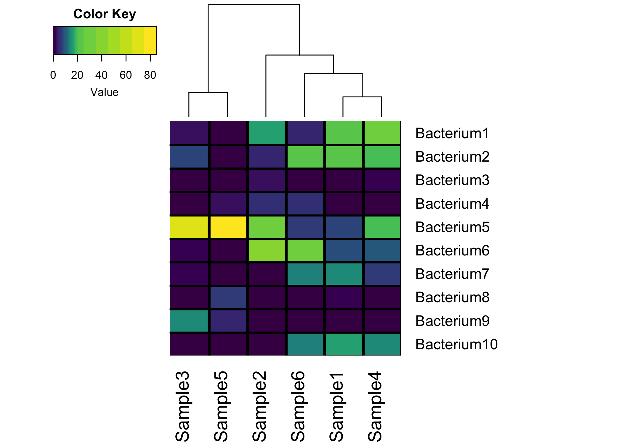
First…here is the finished plot!
Keep reading if you want to make this plot yourself in R!
Biologists love heatmaps, like they REALLY REALLY like heatmaps!! When I was in graduate school, I think my number one google search was “how do I make a heatmap in R”. There are many fantastic tutorials out there that really helped me…and my goal is to create another R heatmap tutorial for the newest of R users. Even if I help out just one person, I will consider this post a success! Any suggestions, please drop me a message!
I really want to make this tutorial as bare-bones as possible and not assume the reader knows anything about R. My only requirement is that you can get R up and running and preferably within the RStudio Interactive Development Environment (IDE).
The Data
A quick few notes about the data, heatmaps work best with continuous data…meaning the data can represent any value along a continuoum. Maybe you are measuring fluoresence intensity, this is continuous data set because the values can be ANY value from the minimum to the maximum. Data that will also work, but really doesn’t lend itself well to heatmaps is discrete data. Let’s say you are recording the number of gears in various car models. The data will likely be only a few numbers like 3, 4, and 5. Since you can’t have a car with 3.486 gears, this represents discrete data.
It’s also a good idea if your data is somewhat “constrained”. To explain this, let’s say you are measuring the diameter of trees in a field. If 99.99% of the trees are 50+ years old and are relatively the same size, most of your values will be within a somewhat small range (eg. 80-100 cm). But let’s say you have one or two tree in your data set that a young, and only have a diameter of 20cm…this will make your heatmap a little hard to interpret since you won’t be able to see small changes between the larger trees. Now there are ways we can “scale” our data, but that’s beyond the scope of this post.
The goal of heatmaps, at least in my hands, has been to visualize the scale of the data but also cluster samples with similar color patterns. Luckily a lot of heatmap packages do the clustering for us…win!
For this example, we are going to generate some mock microbiome relative abundance data. Each row will be a distinct bacterium, each column will be a sample, and each cell value will be a number from 0 to 100 which represents the relative abundance of that bacterium in each sample.
(micro_data <- data.frame(
  Sample1 = c(25, 25, 0, 0, 8, 8.3, 15, 2, 0, 16.7),
  Sample2 = c(17, 5, 3, 6, 28, 40, 1, 0, 0 ,0),
  Sample3 = c(2.4, 7.5, 0, 0, 72, 2, 1.1, 0, 15, 0),
  Sample4 = c(27, 20, 1.1, 0, 19.9, 10, 7, 0, 0, 15),
  Sample5 = c(1, 0, 0, 3, 84, 0, 0, 7, 5, 0),
  Sample6 = c(5, 24, 0, 6, 6.8, 30.2, 14, 0, 0,14),
  row.names = paste0("Bacterium", 1:10)
))
## Sample1 Sample2 Sample3 Sample4 Sample5 Sample6
## Bacterium1 25.0 17 2.4 27.0 1 5.0
## Bacterium2 25.0 5 7.5 20.0 0 24.0
## Bacterium3 0.0 3 0.0 1.1 0 0.0
## Bacterium4 0.0 6 0.0 0.0 3 6.0
## Bacterium5 8.0 28 72.0 19.9 84 6.8
## Bacterium6 8.3 40 2.0 10.0 0 30.2
## Bacterium7 15.0 1 1.1 7.0 0 14.0
## Bacterium8 2.0 0 0.0 0.0 7 0.0
## Bacterium9 0.0 0 15.0 0.0 5 0.0
## Bacterium10 16.7 0 0.0 15.0 0 14.0Since this is relative abundance, all sample columns will equal 100. If you are using RStudio, you should see in one of your panels the micro_data in your Environment:

That’s it! The data is in a format that is usable for various heatmap functions!
The Heatmap Function
One of the best parts of R is the vast collection of publicly available packages that contain tools that anyone can use to help with there analyses. Here is some useful information that I didn’t quite comprehend until much later into my R programming career:
Packages can be built by anyone.
When someone wants to share one of their packages, they can publish them to github. A user (like you) can then download the package directly from github using the
devtools::install_github()function.Some packages that have been meticulously maintend can also be published to the Comprehensive R Archive Network (CRAN). Anytime you see some code, and you see the
install.packages(), this will (typically) install the package from CRAN. There is a small staff of volunteers that maintain the packages on CRAN to ensure their proper functionality (if you ever meet a CRAN maintainer…thank them, because they do amazing work!).
There are tons of packages that implement heatmaps, here are just a few (listed as package::function()):
stats::heatmap() <- the stats package is pre-installed in R
gplots::heatmap.2() <- possibly the most widely used
plotly::plot_ly() <- Makes interactive heatmaps with the type = heatmap argument
superheat::superheat() <- a fantastic heatmap building package that I use frequently
ggplot2::geom_tile() <- My usual go-to for creating custom heatmap from tidy data (if you don’t know about tidy data, no worries!)
For this tutorial, let’s go with the gplots::heatmap.2() function. Let’s first install the gplots package. When you initially install a package, think of it as buying a new car. Once you install the package, it’s now in your posession and ready to be “turned on”. So let’s “buy” the gplots package:
install.packages("gplots")Assuming you did not encounter any errors, this package is now installed on your computer. Or in the car analogy, you just purchased the car and it’s yours! Now before we can use the package, we must “turn it on”…just like turning on your new car:
library(gplots)##
## Attaching package: 'gplots'## The following object is masked from 'package:stats':
##
## lowessGreat! The library is now “turned on” and ready to be used. Everytime you restart R, you will need to make sure you “turn on” your gplots package before you can use it, but you only need to install.packages("gplots") once. If you update your R to a newer version (which you should do frequently), you WILL need to reinstall the package.
Our first heatmap!
You have your data, you have your heatmap function…let’s make a heatmap!
heatmap.2(micro_data)Uh oh! If you ran this command in R, you will have noticed this error message:
Error in heatmap.2(micro_data) : 'x' must be a numeric matrix.
That’s because our data is currently a data frame, not a matrix. You can verify this by running the following command:
class(micro_data)## [1] "data.frame"This is easy to fix, simply wrap our data in the as.matrix() function:
heatmap.2(as.matrix(micro_data))
Hey that looks like a heatmap! You will notice that the heatmap.2 function already clusters your columns and rows (using hierarchial clustering). This figure is not super pretty, so let’s take some time to prettify this heatmap.
Fine Tuning your Heatmap
Resizing
When you saw your heatmap pop up, you may (or may not) have noticed that some of the labels were truncated. That’s because the entire plot is a bit too large for the viewing area. So we need to shrink it a bit. To do this we will modify the margins argument. You will pass a vector of 2 numbers (example: c(5,5)) that will add space below and to the right of the heatmap. Play around with these two numbers and see how it impacts your heatmap.
I’ve also started to add comments to each line of the heatmap.2 code. Anything after the # is a comment and is not interpreted by the machine, they are simply used to make the code more reader-friendly:
heatmap.2(as.matrix(micro_data), # data frame a matrix
          margins = c(6,15)) # Adds margins below and to the right
Remove the density/trace lines
You will also notice some light blue (cyan) lines that are drawn through the heatmap and the legend. These can be useful (especially in the legend), becaues it give you an idea of how frequently values appear in your data. For example, in the above figure legend, you can see that there are a lot of values that are 0. Again, useful, but not really needed…so let’s remove them:
heatmap.2(as.matrix(micro_data), # data frame a matrix
          margins = c(6,15), # Adds margins below and to the right
          density.info = "none", # Remove density legend lines
          trace = "none") # Remove the blue trace lines from heatmap
Remove Row Dendrogram
While it might be important to see how the varous bacteria cluster, most microbiome researchers really care about how samples cluster. So, let’s remove the clustering from the rows, and only keep the column clustering and dendrogram.
heatmap.2(as.matrix(micro_data), # data frame a matrix
          margins = c(6,15), # Adds margins below and to the right
          density.info = "none", # Remove density legend lines
          trace = "none", # Remove the blue trace lines from heatmap
          Rowv = FALSE, # Do not reorder the rows
          dendrogram = "col") # Only plot column dendrogram
Add gridlines
As long as you don’t have a ton of samples/bacteria, adding gridlines to your heatmap can really spruce it up! With the heatmap.2 function, there are two arguments called colsep and rowsep. You want to pass a vector of numbers that tell R where to add vertical and horizontal separating lines:
heatmap.2(as.matrix(micro_data), # data frame a matrix
          margins = c(6,15), # Adds margins below and to the right
          density.info = "none", # Remove density legend lines
          trace = "none", # Remove the blue trace lines from heatmap
          Rowv = FALSE, # Do not reorder the rows
          dendrogram = "col", # Only plot column dendrogram
          colsep=1:nrow(micro_data), # Add vertical grid lines
          rowsep=1:nrow(micro_data), # Add horizontal grid lines
          sepcolor = "black") # Color gridlines black
Adding a custom color scale
If I took the above heatmap image to my boss and said “Here…heatmap!”, he would probably look at it and say, “Ryan…this is not very informative!” And he’d be right, because the majority of our values fall in 0-20 range..and if you look at your legend, there is not much color change in that range…it’s all red. So we need to make a custom color range. This is a bit more advanced, but stay with it and I promise your heatmaps will look amazing AND informative!
First we need to create a custom color gradient. I really like the viridis color gradient, as it’s not only pretty but it’s easy to read for those with colorblindness. Let’s install and load the viridis package:
install.packages("viridis")
library(viridis)
Now let’s feed the viridis::viridis_pal() function into the col argument:
heatmap.2(as.matrix(micro_data), # data frame a matrix
          margins = c(6,15), # Adds margins below and to the right
          density.info = "none", # Remove density legend lines
          trace = "none", # Remove the blue trace lines from heatmap
          Rowv = FALSE, # Do not reorder the rows
          dendrogram = "col", # Only plot column dendrogram
          colsep=1:nrow(micro_data), # Add vertical grid lines
          rowsep=1:nrow(micro_data), # Add horizontal grid lines
          sepcolor = "black", # Color gridlines black
          col = viridis::viridis_pal()) # Make colors viridis
That definitely looks better, but we should still add a little more color separation in the 0-20 range. To do this, we will give the breaks argument a vector. Add more breaks between 0-20 so that more colors are used within this range of values. Again, feel free to play around with this vector of numbers and see how it changes the plot. Here is my custom scale (using the built in seq() function):
c(0:20, seq(from = 25, to = max(micro_data) + 10, by = 10))## [1] 0 1 2 3 4 5 6 7 8 9 10 11 12 13 14 15 16 17 18 19 20 25 35
## [24] 45 55 65 75 85The seq function creates a vector from 25 to the max value in my data set (84) + 10 in intervals of 10. I added the + 10 just to give a little bit of buffer at the end of my vector to ensure the max value was encompassed. Now feed that vector into the col argument:
heatmap.2(as.matrix(micro_data), # data frame a matrix
          margins = c(6,15), # Adds margins below and to the right
          density.info = "none", # Remove density legend lines
          trace = "none", # Remove the blue trace lines from heatmap
          Rowv = FALSE, # Do not reorder the rows
          dendrogram = "col", # Only plot column dendrogram
          colsep=1:nrow(micro_data), # Add vertical grid lines
          rowsep=1:nrow(micro_data), # Add horizontal grid lines
          sepcolor = "black", # Color gridlines black
          col = viridis::viridis_pal(), # Make colors viridis
          breaks = c(0:20, seq(25, max(micro_data) + 10, 10))) # Custom scale of breaks
Save you Heatmap
There are many “devices” that can be used in R to save your plot, but I will go with the png() function. To save a heatmap, you first need to “turn on” the device, plot your heatmap, then you turn the device off. For example:
# Turn on the png device
png(filename = "yourplot.png", width = 5, height = 7, units = "in", res = 300)

# Plot your heatmap
heatmap.2(your_heatmap)

# Turn off png device
dev.off()
The filename argument will be the name of the plot when it is saved to your computer. If you simply give it a name (like I did above), the plot will be saved to whatever your current working directory is. What is my current working directory? Good question. Type this into your R console and see what the output is:
getwd()Maybe your output looks something like this:
"/Users/yourname/Desktop"
This means that once you save your plot, it will be saved to your desktop. So if you ever loose your plots, just run this command and then look in that directory for your plot. Ok, let’s save our heatmap:
png(filename = "myheatmap.png", width = 7, height = 5, units = "in", res = 300)

heatmap.2(as.matrix(micro_data), # data frame a matrix
          margins = c(6,15), # Adds margins below and to the right
          density.info = "none", # Remove density legend lines
          trace = "none", # Remove the blue trace lines from heatmap
          Rowv = FALSE, # Do not reorder the rows
          dendrogram = "col", # Only plot column dendrogram
          colsep=1:nrow(micro_data), # Add vertical grid lines
          rowsep=1:nrow(micro_data), # Add horizontal grid lines
          sepcolor = "black", # Color gridlines black
          col = viridis::viridis_pal(), # Make colors viridis
          breaks = c(0:20, seq(25, max(micro_data) + 10, 10))) # Custom scale of breaks

dev.off()
The units arguments means to save a 7x5 inch image with a pixel resolution of 300 pixels per inch (ppi). Hopefully you can go into your working directory and open up your image. If so…send it to your advisor and be prepared for a “Wow, this is great!” email in response. I hope this helps and please let me know if you have any questions!